When the colours you’ve created come together in balance, it’s like music on canvas. With its viscosity and lustrousness, oil paint particularly exemplifies this. As artists often mix their oils intuitively, the colours they blend start to become an extension of themselves. For me, the act feels like an explorer discovering a new land and can lead to delight and surprise in equal measure.
Of course, there is also virtue in being intentional, and creating a palette you love requires both. Take Georgia O’Keeffe – a user of Winsor & Newton oils, she would spend time premeditating concoctions and tones with swatches. Both of these directions played on my mind when oil mixing with Winsor & Newton.

It was important to pick apart my practice. Why do I veer towards specific colours to evoke emotion? For example, horses in my compositions are repeatedly vibrant cochineal. Is that red evoking emotion, movement, energy? My skies are often rolling, stormy, lilac flecks, in combination with a light, ethereal yellow seeping across the canvas. Do these mixes offer allusions to some other world – a paradise or heavenly realm?
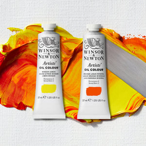
A particularly beautiful mixing marriage that I discovered was Winsor Lemon with Light Yellow Ochre, Titanium White and a kiss of Phthalo Turquoise. An addictive colour was born that could join my palette: a gold-tinged broad bean green. In my practice I might use this as a fleeting lick, a spatter, or a large gestural brushstroke to contrast with deeper, verdant notes.

Mixing Orange Laque Mineral, Titanium White and a touch of Ultramarine Pink amalgamates into a flame orange that I love. When I add further white, coral hints run to the fore. These warmer hues are perfect for enhancing coolness in the greens. I also enjoyed discovering a foxglove purple alongside the lilac, as I see these flowers so often where I live, being surrounded by fields and woods. These purples can intensify bracing yellows, and are moody, brooding and magical.

Because nature plays a role in my art, jungle greens, forest leaf, tomatillo and mint, all dance in procession in my work. These greens and their nuances are subtle, but also compelling. They have a push-pull quality when used side by side on the canvas. Making sibling colours that are similar but different brings about a tense conversation between the two. And it’s this elusive tension that we artists are often seeking.
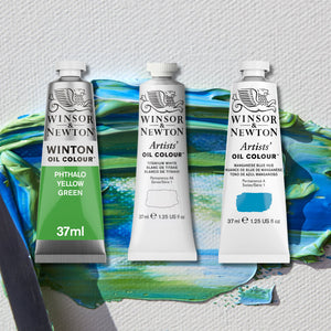
It would be rude not to pay tribute to Manganese Blue when discussing what I enjoyed about this project. A potent blue alone, when jostled with the right ratio of Pale Rose Blush, it became a calming ash.
All these results are from play, seeing what emerges and, initially, not worrying too much about unforeseen outcomes. The joy of paint is that it never ceases to create wonder. When I’m asked about how to approach mixing, the best advice I can give (and that I try to give myself) is to remove any pressure. Colour is a language, each tone a word, that put together in harmony becomes a joyful song. As soon as you overthink, you will find you’re inhibited. Instead of fearing your mistakes, embrace them. For all of us, mistakes and experimentation are an intrinsic part of developing our artistic journey. So try to let go, and create your own colour narrative.


![W&N BLACK FINELINER LS 0.1 [CAP ON]](http://uk.winsornewton.com/cdn/shop/files/64128.jpg?crop=center&v=1736866967&width=20)
![WN COTMAN 8 PC FLORAL POCKET BOX [OPEN WITH STICKER] 884955081129](http://uk.winsornewton.com/cdn/shop/files/132624.jpg?crop=center&v=1761839596&width=20)
![W&N COTMAN WATERCOLOUR 8HP FLORAL POCKET SET [FRONT]](http://uk.winsornewton.com/cdn/shop/files/97499.jpg?crop=center&v=1760698026&width=20)

![WN PROMARKER COOL GREY 3 [COMPOSITE] 884955041406](http://uk.winsornewton.com/cdn/shop/files/77586.jpg?crop=center&v=1741263144&width=20)

![W&N SERIES 7 KOLINSKY SABLE BRUSH ROUND [SHORT HANDLE]](http://uk.winsornewton.com/cdn/shop/files/11424.jpg?crop=center&v=1762864605&width=20)
![W&N GALERIA ACRYLIC TUBE 60ML TITAN WHITE 08 [COMPOSITE] 094376914061](http://uk.winsornewton.com/cdn/shop/files/9396.jpg?crop=center&v=1714072593&width=20)
![W&N GALERIA [SWATCH] TITANIUM WHITE](http://uk.winsornewton.com/cdn/shop/files/3097.jpg?crop=center&v=1714072593&width=20)
![W&N GALERIA CARDBOARD SET 10X12ML 884955097809 [OPEN]](http://uk.winsornewton.com/cdn/shop/files/138856.jpg?crop=center&v=1725031476&width=20)
![W&N GALERIA CARDBOARD SET 10X12ML [B014096] 884955097809 [FOP]](http://uk.winsornewton.com/cdn/shop/files/138855.jpg?crop=center&v=1725031475&width=20)