
Chloe is a mixed media artist based in rural Hampshire, UK. She has worked with Winsor & Newton on campaigns such as Revival Watercolours and our new Artists’ Oil Colours. She uses watercolour, oil and acrylic to paint ‘imagined dreamscapes’ taking inspiration from nature.

What notebooks did you reinterpret?
'The Art of Pen and Ink Drawing' and 'The Sketcher's Colour Manual - Watercolour Technique'
How did you approach this unique project?
As some of the historic colours in the archives don’t exist in modern day Winsor & Newton Galeria Acrylics - my chosen medium for this commission - I started with research. First stop was Stephanie Nebbia, Winsor and Newton’s resident artist and archive expert, who was able to suggest contemporary acrylic alternatives to hues such as Rose Madder, Lake and Sepia.

For a new reading of the archival female illustration, I felt I had the freedom to create my view from a contemporary woman’s perspective. Each brushwork was loose, characterised by spontaneous and expressive brushwork, in contrast with the more formal and representational style in front of me. Victorian art often focused on narrative and for this piece, it’s particularly illustrative.
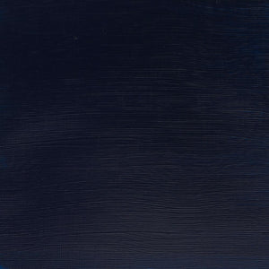
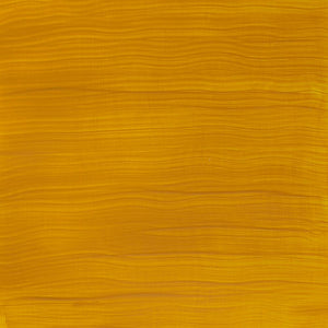
I prioritised expression, exploring femininity, joy, the physicality of painting itself. The rhythmical earth is a blend of Cadmium Orange Hue, Permanent Rose and Titanium White. There’s also a hint of Yellow Ochre and Cadmium Red Hue. Nature is exaggerated, depicted with more radical blue hues, from Cobalt Blue to Ultramarine and Prussian.

The approach for the cloud paint mixes was more about investigating swatches, whipping up the colour suggestions from the archives. I worked with both Winsor & Newton Galeria Acrylics and Artists’ Oil Colours, each offering its own texture and intensity. The challenge was imagining the original intention.

When it came to the brighter combinations, for example blends like Lake and Little Red, was the purpose to conjure a sunset? Or the sky can appear orange depending on how sunlight interacts with particles in the atmosphere. The suggestions are minimal, prescriptive; marry these two colours to evoke a specific mood, so this is the avenue I took. One quick experiment even ended up in a Rothko-like block on the paper. The way the layers bled into and pushed against one another gave the pieces depth, a quiet spatial complexity that felt less about representation and more so sensation.


![W&N COTMAN WATER COLOURS H/P LEMON YELLOW HUE [COMPOSITE] 094376901658](http://uk.winsornewton.com/cdn/shop/files/10262.jpg?crop=center&v=1714069205&width=20)
![W&N COTMAN [SWATCH] LEMON YELLOW HUE](http://uk.winsornewton.com/cdn/shop/files/2922.jpg?crop=center&v=1714069205&width=20)

![WN PROMARKER COOL GREY 3 [COMPOSITE] 884955041406](http://uk.winsornewton.com/cdn/shop/files/77586.jpg?crop=center&v=1741263144&width=20)
![W&N DESIGNERS GOUACHE 14ML ZINC WHITE [COMPOSITE] 50947195](http://uk.winsornewton.com/cdn/shop/files/10437.jpg?crop=center&v=1717586081&width=20)
![W&N DESIGNERS GOUACHE [SWATCH] ZINC WHITE](http://uk.winsornewton.com/cdn/shop/files/3022.jpg?crop=center&v=1714143175&width=20)
![W&N GALERIA ACRYLIC TUBE 60ML TITAN WHITE 08 [COMPOSITE] 094376914061](http://uk.winsornewton.com/cdn/shop/files/9396.jpg?crop=center&v=1714072593&width=20)
![W&N GALERIA [SWATCH] TITANIUM WHITE](http://uk.winsornewton.com/cdn/shop/files/3097.jpg?crop=center&v=1714072593&width=20)

![W&N BLACK FINELINER LS 0.1 [CAP ON]](http://uk.winsornewton.com/cdn/shop/files/64128.jpg?crop=center&v=1736866967&width=20)
![WN COTMAN 8 PC FLORAL POCKET BOX [OPEN WITH STICKER] 884955081129](http://uk.winsornewton.com/cdn/shop/files/132624.jpg?crop=center&v=1761839596&width=20)
![W&N COTMAN WATERCOLOUR 8HP FLORAL POCKET SET [FRONT]](http://uk.winsornewton.com/cdn/shop/files/97499.jpg?crop=center&v=1760698026&width=20)