Colour recipes: How to mix the top six requested colours
Creating a palette involves more than just selecting colours; it’s about mixing them to tell stories and is an integral part of an artist’s DNA. We asked artist Chloe Scott Moncrieff to create the six most requested colours using Winsor & Newton oil paints. Read on as we explore these sought-after shades.

Lilac
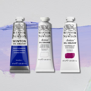
French Ultramarine + Ultramarine Pink + Titanium White
When we scrutinise the colour lilac in nature, we see sultry pinks, purple, perhaps a nip of blue. When creating a lilac colour myself, I wanted something evocative – florid yet sultry. Winsor & Newton’s Mauve Blue with Naples Yellow produced a light, pretty violet, but without pink it lacked warmth. How about a pip of Magenta with a large daube of Titanium White? Too pink in this instance. A revelation came to me when I finally realised how much Ultramarine Pink contributed to the final recipe – its soft warmth plays centre stage.

Hot Coral Pink
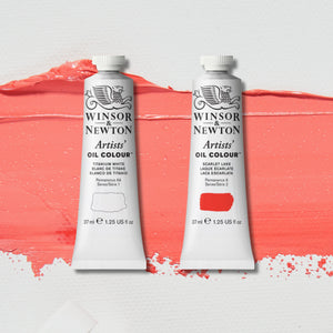
Scarlet Lake + Titanium White
Scarlet Lake is exceptionally bright. Depending on the ratios used, it can make various incandescent oranges when mixed with Yellow Ochre Light and Winsor Lemon. A more mellow outcome, on the other hand, is when it is combined with buttery Titanium White. The orange undertones create a hazy but optimistic pink.

Olive Green
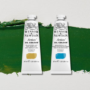
Manganese Blue + Yellow Ochre Light
When I was on a walk in the woods, I noticed that the canopy was shading the trees. Its shadow dropped onto the chlorophyll-drooping foliage, and the result was a deep forest green that my eyes feasted upon. An unlikely route to this life-affirming colour is Yellow Ochre Light with a nudge of Manganese Blue. Here, I found a deep, calming shade of dark olive. It contrasts well with light dusty pink and oranges.

Cyan
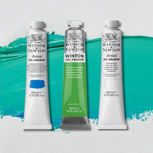
Manganese Blue + Titanium White + Phthalo Yellow Green
If we are to go by Picasso’s blue paintings, cool palettes stir feelings just as much as they help formal composition. I wanted my mix to be crisp. The Manganese Blue is terrific for this: mid-tone with a clear greenish azure. To achieve a soothing cocktail, all that was needed was some Titanium White and a trace of Phthalo Yellow Green.

Maroon Raisin
Burnt Umber + Rose Madder Alizarin
Burgundy and maroon are similar, but there are key differences. For example, burgundy errs on being more purple in tone, while maroon is browner. I wanted to use Burnt Umber for its strong, warm undercurrent. I liked its reddish tinge, and a little Burnt Umber blended with a heavier ratio of berry hints from Ruby Madder Alizarin produced a beguiling rich raisin.

Sky Blue
Ultramarine Blue + Titanium White
What colour is the sky? To me, it’s a gamut. ‘Sky blue’ is a colour no doubt debated over. While there is no definitive answer, Phthalo Turquoise (greener) versus Manganese Blue and Ultramarine were all candidates for this title. But it was French Ultramarine, with its leaning towards purple (its etymology is ‘beyond the sea’) that appealed. Mix a small amount with Titanium White and a crispness emerges, evoking the atmosphere of a winter morning.


![W&N BLACK FINELINER LS 0.1 [CAP ON]](http://uk.winsornewton.com/cdn/shop/files/64128.jpg?crop=center&v=1736866967&width=20)
![WN COTMAN 8 PC FLORAL POCKET BOX [OPEN WITH STICKER] 884955081129](http://uk.winsornewton.com/cdn/shop/files/132624.jpg?crop=center&v=1761839596&width=20)
![W&N COTMAN WATERCOLOUR 8HP FLORAL POCKET SET [FRONT]](http://uk.winsornewton.com/cdn/shop/files/97499.jpg?crop=center&v=1760698026&width=20)

![WN PROMARKER COOL GREY 3 [COMPOSITE] 884955041406](http://uk.winsornewton.com/cdn/shop/files/77586.jpg?crop=center&v=1741263144&width=20)

![W&N SERIES 7 KOLINSKY SABLE BRUSH ROUND [SHORT HANDLE]](http://uk.winsornewton.com/cdn/shop/files/11424.jpg?crop=center&v=1762864605&width=20)
![W&N GALERIA ACRYLIC TUBE 60ML TITAN WHITE 08 [COMPOSITE] 094376914061](http://uk.winsornewton.com/cdn/shop/files/9396.jpg?crop=center&v=1714072593&width=20)
![W&N GALERIA [SWATCH] TITANIUM WHITE](http://uk.winsornewton.com/cdn/shop/files/3097.jpg?crop=center&v=1714072593&width=20)
![W&N GALERIA CARDBOARD SET 10X12ML 884955097809 [OPEN]](http://uk.winsornewton.com/cdn/shop/files/138856.jpg?crop=center&v=1725031476&width=20)
![W&N GALERIA CARDBOARD SET 10X12ML [B014096] 884955097809 [FOP]](http://uk.winsornewton.com/cdn/shop/files/138855.jpg?crop=center&v=1725031475&width=20)