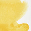
![W&N PROFESSIONAL WATER COLOUR H/PAN BISMUTH YELLOW [COMPOSITE] 094376550047](http://uk.winsornewton.com/cdn/shop/files/10076.jpg?crop=center&v=1714059229&width=20)
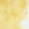
![W&N PROFESSIONAL WATER COLOUR BISMUTH YELLOW [SWATCH]](http://uk.winsornewton.com/cdn/shop/files/125269.jpg?crop=center&v=1714059229&width=20)
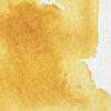
![W&N PROFESSIONAL WATER COLOUR 5ML BISMUTH YELLOW [COMPOSITE] 50694679](http://uk.winsornewton.com/cdn/shop/files/10591.jpg?crop=center&v=1717078710&width=20)
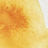
![W&N PROFESSIONAL WATER COLOUR 14ML BISMUTH YELLOW [COMPOSITE] 50694310](http://uk.winsornewton.com/cdn/shop/files/10621.jpg?crop=center&v=1717078710&width=20)
![W&N PROFESSIONAL WATER COLOUR [SWATCH] BISMUTH YELLOW](http://uk.winsornewton.com/cdn/shop/files/3163.jpg?crop=center&v=1714059229&width=20)

































































































 Download safety data sheet

I like this red included
"I like this red included in my primaries. As a beginner in watercolour I’m learning to mix more colours and wanted an extra limited pallet to travel with. Gives a nice range of tones."

Professional Watercolour
Add name of selected colour






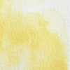

Our Professional Watercolour is recognised for using only the purest pigments to ensure quality, strength and permanence of colour. With a balanced palette of 107 colours, most of them single pigment, our range offers vibrant colours and unrivalled performance.
Specifications
| SKU: | 094376550047 |
|---|---|
| Color Number: | 25 |
| Lightfastness: | Excellent |
| Opacity: |
 Semi-Opaque
 |
| Series: | 3 |
| Pigment Code: | PY184 |
| Granulation/staining: | Staining |
| Permanence: | Permanent |
Our watercolours were used by the greats – as Turner - and are still the first choice of today's artists.

Our range uses only the finest pigments which is why they are known for their brilliance, permanence and strength of colour. With 79 single pigment colours, we offer the widest range of modern and traditional pigments.

Formulated using the highest quality methods to achieve optimal pigment dispersion, our unrivalled transparency means every wash will remain vibrant and luminescent.

104 out of 108 colours in the Professional Watercolour range are rated AA or A for permanence to ensure that the colours used today will appear the same for generations to come.

Pans are portable and air dry, very useful when working outside or when needing to work quickly. Tubes are wet paint, perfect for working at a large scale with a quicker release and particularly helpful with a restricted palette.
Overall rating: 4.90604 / 5 from 149 reviews.
Professional Watercolour - Bismuth Yellow is praised for its excellent quality and vibrant color. Customers appreciate its bright, opaque lemon yellow hue and its ease of use.
Review topics: ["colors","delivery","quality","paint","value","pigment","service","winsor","newton","watercolors","watercolour","shades","orange","addition","coverage","postcards","grey","windsor","make","blue","tones","greens"].
"I like this red included in my primaries. As a beginner in watercolour I’m learning to mix more colours and wanted an extra limited pallet to travel with. Gives a nice range of tones."
"As a floral artist, I love W&N professional watercolours, because of the beautiful depth of the colours and their huge versatility. Ideal for painting all the nuances of nature. Besutiful paints, and excellent service."
"A beautiful, warm yellow that mixes cleanly and gives lovely natural golden tones without becoming harsh. It is strong enough to be useful but remains easy to control in a wash."
"Purchased to refill my half pans. I like the colour, and tones of this paint. It’s well pigmented so a little goes a long way and great on its own or as a mixer."
"The perfect sky! The colour you drop in when you’re asked for ‘a nice sky’ when the photo you’re sent is just, well, dull…. . and grey😜"
"I bought this as it was recommended in an online tutorial. I use it as a base for a variety of colours, especially for shadows. I find it's slightly grainy which adds a lovely texture to a painting when applied. I'll be using it more in the future."
"Good watercolour for mixing. I like the pigment and range of tones I can achieve."
"I love this color, have previously tried to mix colors to create a similar color, and now I don't have to! Winsor Newton is exceptional and I am learning that quality materials make the creative journey better."
"Learning the difference from Cotman but clearly better quality. It’ll come with time I’m sure"
"Service was top class as I would expect professional water colour matches this standard. M"
Your cart is currently empty.
Start Shopping![W&N COTMAN [SWATCH] LEMON YELLOW HUE](http://uk.winsornewton.com/cdn/shop/files/2922.jpg?crop=center&v=1714069205&width=20)
![WN PROMARKER COOL GREY 3 [COMPOSITE] 884955041406](http://uk.winsornewton.com/cdn/shop/files/77586.jpg?crop=center&v=1741263144&width=20)
![W&N DESIGNERS GOUACHE [SWATCH] ZINC WHITE](http://uk.winsornewton.com/cdn/shop/files/3022.jpg?crop=center&v=1714143175&width=20)
![W&N GALERIA [SWATCH] TITANIUM WHITE](http://uk.winsornewton.com/cdn/shop/files/3097.jpg?crop=center&v=1714072593&width=20)
![W&N BLACK FINELINER LS 0.1 [CAP ON]](http://uk.winsornewton.com/cdn/shop/files/64128.jpg?crop=center&v=1736866967&width=20)
![W&N COTMAN WATERCOLOUR 8HP FLORAL POCKET SET [FRONT]](http://uk.winsornewton.com/cdn/shop/files/97499.jpg?crop=center&v=1760698026&width=20)
![W&N COTMAN WATER COLOURS H/P LEMON YELLOW HUE [COMPOSITE] 094376901658](http://uk.winsornewton.com/cdn/shop/files/10262.jpg?crop=center&v=1714069205&width=20)

![W&N DESIGNERS GOUACHE 14ML ZINC WHITE [COMPOSITE] 50947195](http://uk.winsornewton.com/cdn/shop/files/10437.jpg?crop=center&v=1717586081&width=20)
![W&N GALERIA ACRYLIC TUBE 60ML TITAN WHITE 08 [COMPOSITE] 094376914061](http://uk.winsornewton.com/cdn/shop/files/9396.jpg?crop=center&v=1714072593&width=20)

![WN COTMAN 8 PC FLORAL POCKET BOX [OPEN WITH STICKER] 884955081129](http://uk.winsornewton.com/cdn/shop/files/132624.jpg?crop=center&v=1761839596&width=20)